
Coal gas competition is changing, but the standard view doesn't see it
A better framework for what's structural versus seasonal

In the shale era, gas has taken 17 Bcfd of market share from coal in power generation, driven by both coal retirements and falling gas prices. But now those drivers are reversing — coal retirements are winding down, and gas prices are rising — and two new ones have entered the picture: load growth is accelerating (at least until the last few months), and renewable capacity is growing at a record pace. The combination of these factors is reshaping both the level and seasonality of gas demand, and the traditional shortcut method for monitoring gas-fired generation will give misleading answers about what’s structural versus seasonal.
How do analysts typically look at gas demand curves?
Gas-fired generation depends on two main drivers:
Total generation levels, and therefore how much fossil-fired generation is needed
Gas prices, and thus how much comes from gas versus coal.
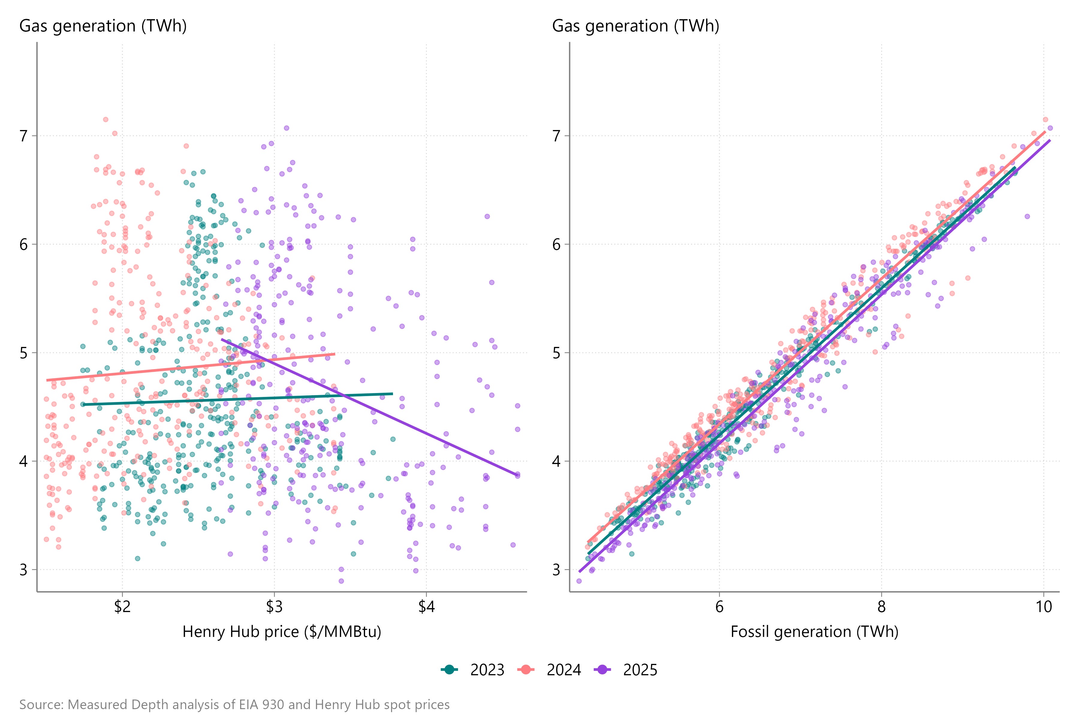
However, because both fossil fuel generation and gas prices are important drivers of gas demand, a univariate model based on either one yields spurious results. The gas-versus-price view shows wildly different slopes year to year because fossil generation varies so much from day to day. Conversely, the gas-versus-fossil view shows a tighter relationship, but year-on-year shifts look structural when they’re actually just price moves.
Figure 1 | Gas-fired generation relative to gas prices and fossil generation
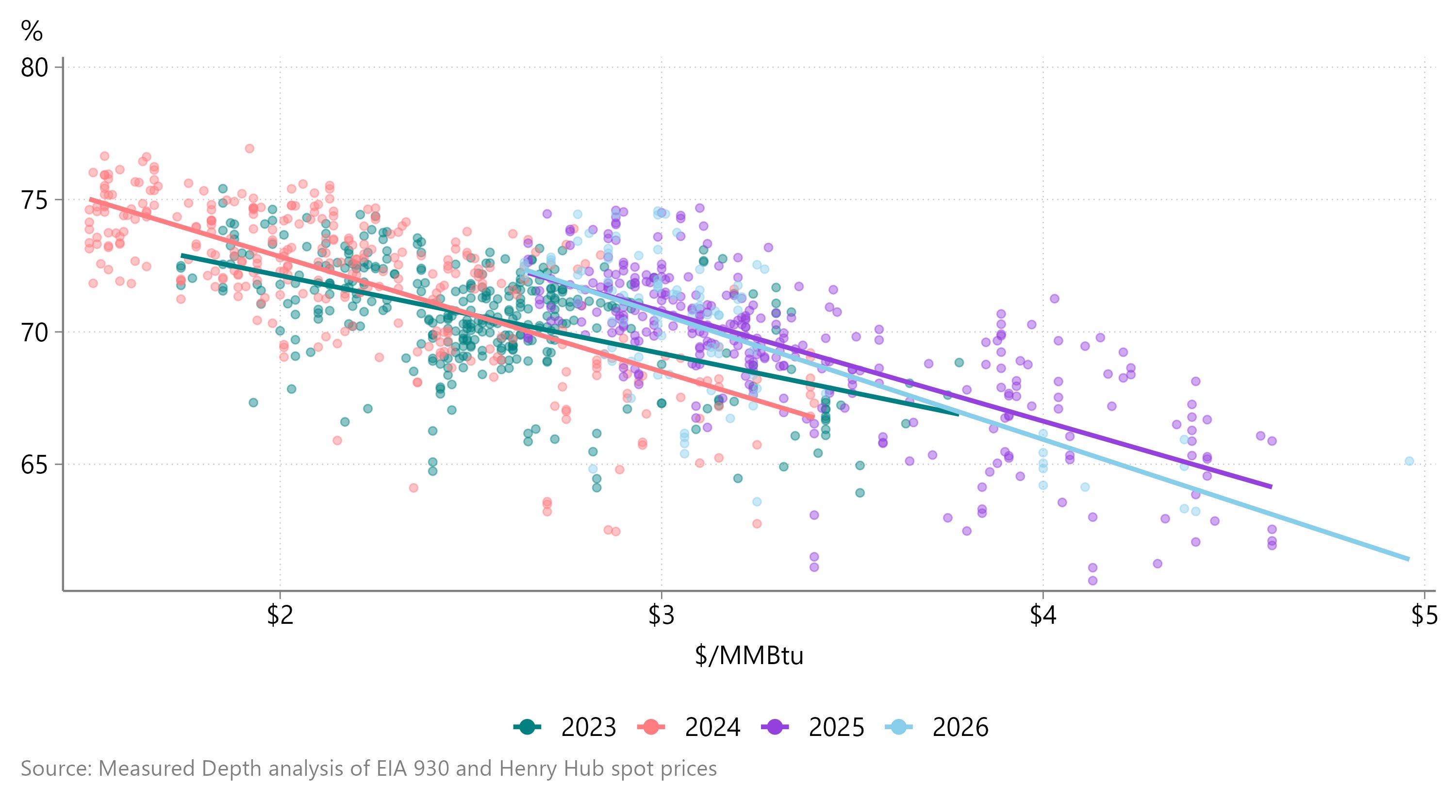
Because electric demand varies widely through the year based on the weather, analysts typically try to neutralize for total generation by instead looking at gas’s share of fossil generation, as in Figure 2.
Figure 2 | Gas share of fossil generation
C. Thi Nguyen’s new book, The Score,1 helped crystallize what I think is wrong with this approach and with gas-analyst power forecasting I see. Nguyen argues — and I agree — that:
Real understanding involves having a mental model of some scientific phenomenon that allows you to make predictions, explain new events, and come up with new solutions. You’re not stuck with a few rote, memorized procedures. You can adapt to new circumstances, diagnose new problems, and improvise new solutions, because you understand how the parts fit together.
And in this case, to interpret what’s happening with gas-fired generation, you need to ground that analysis in an understanding of power dispatch, in which individual fossil generators bid into the market based on their fuel input costs and operational characteristics. The most robust way to model power generation, then, is with an hourly dispatch model that accounts for load shapes, minimum capacity factors, ramp times, how heat rates vary with capacity factors, and more. Of course, that requires a huge investment of both time and money, and it doesn’t pencil out for everyone.
But at the very least, everyone can afford to ground their models in how power dispatch works, so as to better disentangle what’s happening. The question we should be asking is: how closely does your simplified model mimic a dispatch model? In the case of “share of fossil generation,” the answer is not at all. That model implicitly assumes that power generators vary the share of their generation that’s gas-fired in response to gas prices, whereas in reality, the share of generation that’s gas-fired is the result of individual unit dispatch.
What can we learn with a better approach?
The good news is that, compared with other demand sectors and especially with production, granular power data is available with very short lags.2
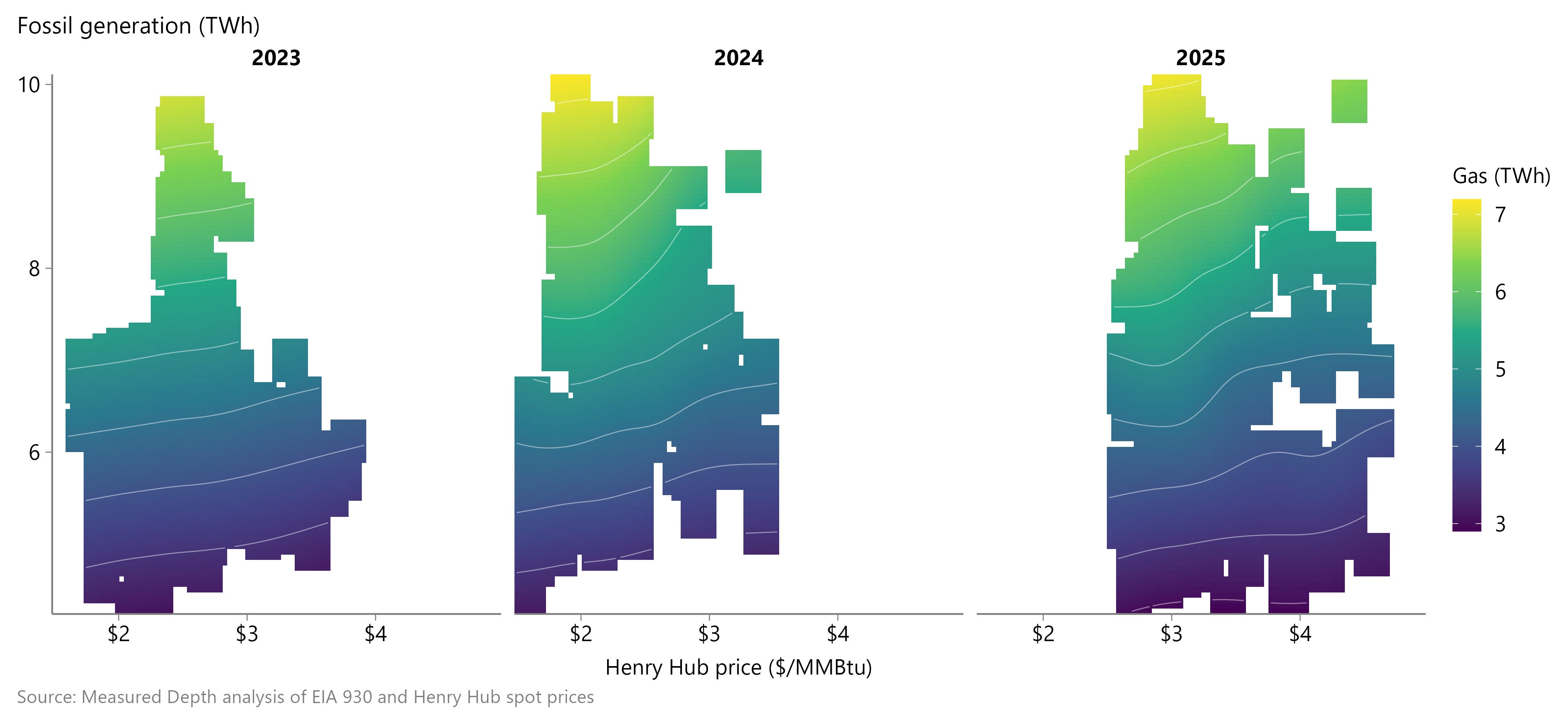
And that data confirms that not only does gas-fired generation depend on fossil generation and gas prices, but that the elasticity in gas demand is non-linear with respect to both prices and fossil generation. Figure 3 shows gas generation on the color scale as a function of gas prices on the horizontal axis and fossil generation on the vertical axis.
These surfaces highlight a key insight that the traditional share-of-generation in Figure 2 misses. On low-demand days in 2025, when fossil demand was ~5 TWh, the color barely changes — meaning gas demand barely declines — as gas prices rise. Conversely, at ~7 TWh of fossil generation, the color changes more quickly, from light green at $2.50 to blue at $4. More concretely, I estimate ~140 GWh (~1.1 Bcfed) of elasticity per $1/MMBtu move in gas prices on these low-demand days, but ~290 GWh (~2.2 Bcfed) on a moderate-demand day.
Figure 3 | Gas-fired generation surfaces
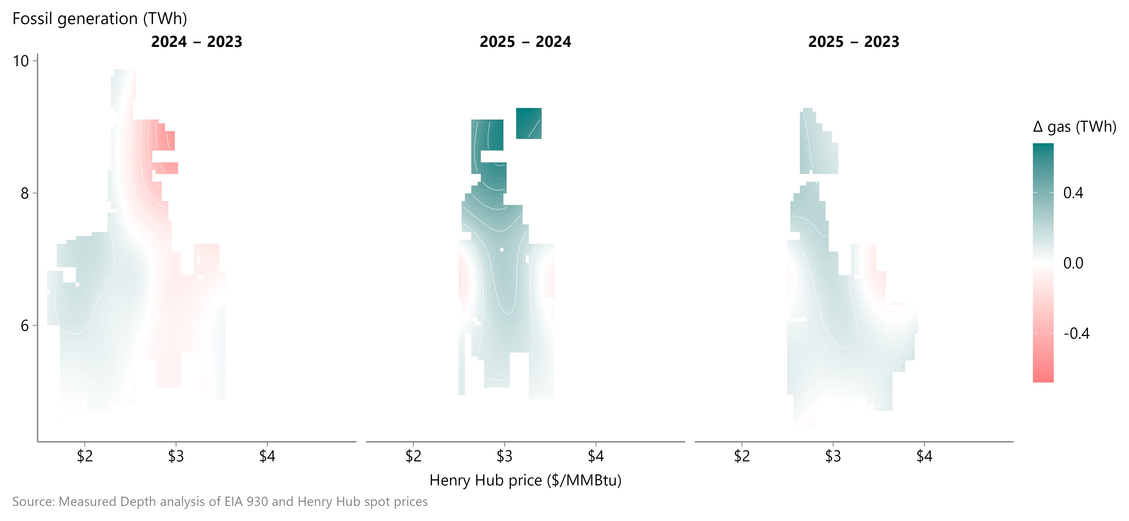
We can also compare these surfaces from year to year to understand how gas-coal competition has evolved. Figure 4 shows the year-to-year change in these gas demand surfaces. We see that coal-gas competition was relatively unchanged in 2024, as shown in the relatively white panel on the left, before gas demand accelerated in 2025, albeit mostly on high-demand days, as shown in the green area at the top.
Figure 4 | Year-over-year change in gas-fired generation
This approach, then, lets us identify impactful trends that the “share of fossil generation” approach can’t, like:
Why is gas-fired generation less elastic at lower fossil generation levels?
Why did gas stop taking market share from coal in 2024, and why was 2025 growth concentrated on higher-demand days?
What does the 2026 year-to-date shape tell us?
I'll work through these in the next post — subscribe to get it in your inbox.
Recommended — Nguyen's broader argument is about how metrics distort the activities they measure, with applications well beyond gas analysis
The EIA 930 reports electric generation by fuel source and balancing authority in more or less real time, while the EPA’s Clean Air Markets Program Data reports hourly generation for all fossil units with a nameplate capacity of at least 25 MW, with a one-quarter lag.